Tab Set Control
Tab headers overflow onto a second line
Control overflows to the right
See also: Containers, Introduction to Styling, Styling Assistants, Controls, Layouts
Introduction
The ability to create a tabbed set is provided by two controls:
- Tab Set Control : represents the entire tabbed set; most configuration properties are configured on this control.
- Tab Control : represents a single tab plus the contents of that tab.
The user can switch to any tab by clicking the appropriate tab header. The displayed tab can also be changed programmatically at any time. A tab header can contain a text and/or a single image; if an image is displayed as part of the tab, its location can be to the right or left of the text. Tab header images are configured using the Tab Control properties.
A tabbed set is created by first adding a Tab Set Control – this will create a tabbed set with a single tab represented by a Tab Control. Additional tabs (Tab Controls) can then be added to the Tab Set Control as required.
Tab Set Control
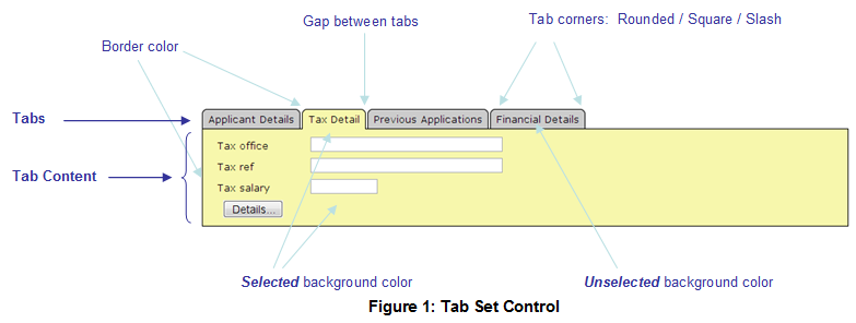
A Tab Set Control represents the entire tabbed set. Its main properties are illustrated in the diagram below:

When a tab is selected, a border specified by the border color property is drawn around both the selected tab header and its associated content panel; the background specified by the selected background color property is also applied. When a tab is unselected, the unselected background color is applied as a background color just to the tab header.
Properties
See also control common properties and local/inherited control properties.
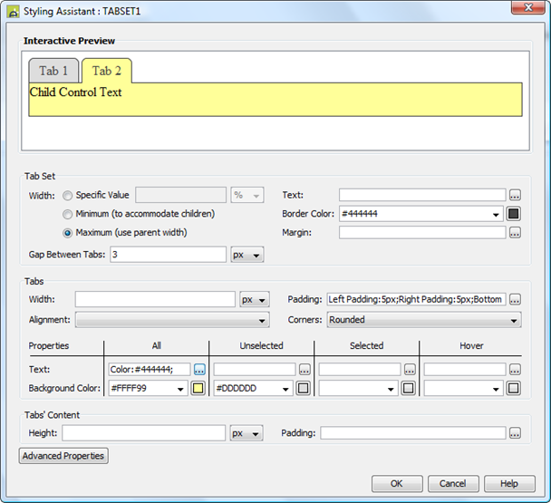
Style Tab – Styling Assistant

|
Property |
Description |
Name1 |
Type1 |
Get1 |
Set1 |
Get/Set Values1 |
|
|
Tab Set: |
The following properties apply to the entire Tab Set Control |
|
|
|
|
|
|
|
Width |
Sets the width to one of the following: · A specific value e.g. 300px · The minimum value: this results in the Tab Set Control being just as wide as it needs to be to accommodate its content. · The maximum value: the width is taken from the parent container control. This width will then include the Tab Set Control plus any configured padding, border or margins. Note that this setting will be ignored if the parent container layout specifies a horizontal cell alignment of fill (this applies to Horizontal Box, Vertical Box and Column layouts). This is equivalent to specifying maximum above. Warning: when a specific value is set, any padding, border or margins will be in addition to the specified value and can cause the Panel Control to “break out” of its parent space. In particular, try and avoid specifying a width of 100%; use maximum instead. See also: understanding width. |
Width |
Character |
Yes |
Yes |
As per CSS width property. |
|
|
Text |
Sets the text properties for the entire Tab Set Control, including both tab headers and the content panels. See text properties. |
|
|
|
|
|
|
|
The border color applied to both the tabs and the content panel. See description above. |
tabBorderColor |
Character |
Yes |
Yes |
As CSS color property |
||
|
Margin |
Margin is the space between the control and its neighbours. See margin properties. |
|
Character |
Yes |
Yes |
As CSS color property |
|
|
Gap Between Tabs |
The space between adjacent tab headers. See description above. |
spaceBetweenTabs |
Character |
Yes |
Yes |
As CSS font-size property |
|
|
Tabs: |
The following properties apply to the tab headers |
|
|
|
|
|
|
|
Width |
Specifies the width of all tab headers. If not specified, the width is determined by the tab header content. |
tabWidth |
Character |
Yes |
Yes |
As per CSS width property. |
|
|
Padding |
Padding is the space between the tab header text and its border. See padding and margin properties. |
allState .xxx |
|
|
|
|
|
|
Alignment |
Specifies the horizontal alignment for the text within each tab header. This is only effective if a tab width has been specified. |
allState .hAlign |
Character |
Yes |
Yes |
Click here for values. Value Fill is not supported. |
|
|
Corners |
The style of corner applied to the top left and top right corners of all tab headers. Options are: · Rounded – corners are drawn with a rounded image · Square – corners are square · Slash – corners are a straight diagonal line The border color is applied to the corners. |
tabCornerType |
Character |
Yes |
Yes |
Rounded Square Slash |
|
|
The following
properties apply just to the named tab state: ·
All – act as default unless specified in one of the other states ·
Unselected – apply only when the tab is not selected ·
Selected – apply only when the tab is selected · Hover – apply when the mouse is moved over the tab header |
|
|
|
|
|
||
|
Text |
Sets the text properties for the tab header for the appropriate state. See text properties. |
allState.xxx unselectedState.xxx selectedState.xxx hoverState.xxx |
|
|
|
|
|
|
The background color applied to both tab header and its content panel for the appropriate state (the background color is only applied to the content panel in the selected state). See description above. |
tabAllColor tabColor tabSelectedColor tabHoverColor |
Character |
Yes |
Yes |
As CSS background-color property |
||
|
Tabs’ Content: |
The following properties apply to the tab panel displayed when a tab is selected |
|
|
|
|
|
|
|
Height |
The height of the tab content panel. |
Height |
Character |
Yes |
Yes |
As per CSS height property |
|
|
Padding |
Padding is the space between the tab content panel and its border. See padding and margin properties. |
contentPanel |
|
|
|
|
|
|
|
|
|
|
|
|
||
|
Style |
CSS class and inline style applied to the entire tab set. |
cssClass style |
Character |
Yes |
Yes |
As per HTML class parameter As per HTML style parameter |
|
|
Header Style |
CSS class and inline style applied to all tab headers. |
tabHeaderClass tabHeaderStyle |
Character |
Yes |
Yes |
As per HTML class parameter As per HTML style parameter |
|
|
Unselected style |
CSS inline style applied to all unselected tab headers. |
unselectedTextStyle |
Character |
Yes |
Yes |
As per HTML style parameter |
|
|
Selected Style |
CSS inline style applied to both the tab header and the tab content panel when a tab has been selected. |
selectedTextStyle |
Character |
Yes |
Yes |
As per HTML style parameter |
|
|
Hover Style |
CSS inline style applied to all tab headers when the mouse is hovered over the tab header. |
hoverTextStyle |
|
|
|
As per HTML style parameter |
|
|
Contents’ Style |
CSS class and inline style applied to the tab content panels. |
panelClass panelStyle |
Character |
Yes |
Yes |
As per HTML class parameter As per HTML style parameter |
|
|
Use the following
properties to override the automatically generated images used for the top
left and top right corners of the tab headers e.g. if larger corners are
required. |
|
|
|
|
|
||
|
Left Tab Image |
Unselected state left image |
leftTabImage |
Character |
Yes |
Yes |
See URL properties |
|
|
Right Tab Image |
Unselected state right image |
rightTabImage |
Character |
Yes |
Yes |
See URL properties |
|
|
Left Selected Tab Image |
Selected state left image |
leftSelectedTabImage |
Character |
Yes |
Yes |
See URL properties |
|
|
Right Selected Tab Image |
Selected state right image |
rightSelectedTabImage |
Character |
Yes |
Yes |
See URL properties |
|
|
Left Hover Tab Image |
Hover state left image |
leftHoverTabImage |
Character |
Yes |
Yes |
See URL properties |
|
|
Right Hover Tab Image |
Hover state right image |
rightHoverTabImage |
Character |
Yes |
Yes |
See URL properties |
|
Html Element Properties Tab
This allows you to add element properties to the root element of the Control – see Html Element Properties for more information.
Events tab
|
Property |
Description |
Name1 |
Type1 |
Get1 |
Set1 |
Get/Set
Values1 |
|
On tab click |
Configure scripts to run at the tab on click event. This event is fired when the user clicks on any unselected tab header. The new tab will automatically be displayed as the selected tab; this event can perform any required processing prior to displaying the new tab or can change the default behaviour. Validation events for all controls included in the current tab content panel will be run prior to running this event. See Events for more information. |
|
Character |
No |
No |
|
|
Skip validation |
Specifies that the system will omit all validation prior to executing the on tab click event. See skip validation for details. |
skipValidation |
Boolean |
Yes |
Yes |
|
Runtime only properties
|
Property |
Description |
Name1 |
Type1 |
Get1 |
Set1 |
Get/Set
Values1 |
|
Contains the item name of the currently selected tab. |
selected |
Character |
Yes |
Yes |
See tab set programming. |
1 See accessing control properties from scripts
Examples of setting properties via API based language:
controls.TABSET1.width
= "300px";
controls.TABSET1.tabWidth
= "80px";
controls.TABSET1.textColor
= "#FFFFCC";
controls.TABSET1.allState.allPadding
= "5px";
controls.TABSET1.tabSelectedColor
= "#FF9999"; //
selected state background color
controls.TABSET1.selectedState.textColor
= "#000000"; // selected
state text color
controls.TABSET1.panelClass
= "myclass1";
Examples of setting properties via FPL:
set TABSET1.width = '300px';
set TABSET1.tabWidth = '80px';
set TABSET1.textColor = '#FFFFCC';
set TABSET1.allState.allPadding = '5px';
set TABSET1.tabSelectedColor = '#FF9999'; // selected state background color
set TABSET1.selectedState.textColor =
'#000000'; // selected state text color
set TABSET1.panelClass = 'myclass1';
See also tab set programming.
Right Click Menu Actions
Click here for right-click menu actions available to all controls.
There are no specific right click actions for this control.
Appearance in Outline View
A Tab Set Control is shown with the control name in brackets:
![]()
Tab Control
A Tab Control represents a single tab within a Tab Set Control. Each tab header can contain a text and/or a single image; if an image is displayed as part of the tab, its location can be to the right or left of the text. Each Tab Control acts as a container for any content added to the tab.
Properties
See also control common properties and local/inherited control properties.
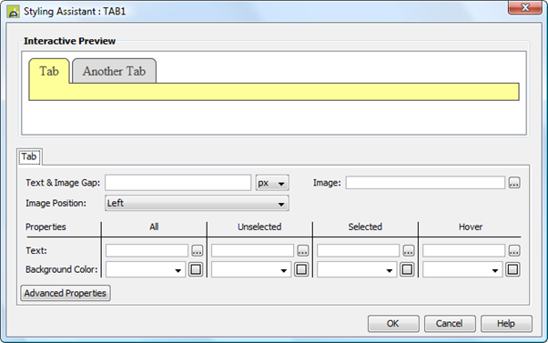
Style Tab – Styling Assistant

|
Property |
Description |
Name1 |
Type1 |
Get1 |
Set1 |
Get/Set Values1 |
|
Tab Header: |
The following properties apply to the tab header |
textImageGap |
|
|
|
|
|
Text & Image Gap |
The gap between the text and any configured image. |
width |
Character |
Yes |
Yes |
As per CSS font-size property |
|
Image |
Width, height and border properties for tab header image. See image properties. |
imageProperties |
Character |
Yes |
Yes |
|
|
Image Position |
Specifies the position of the image relative to the text. Options are Left and Right. |
imagePosition |
Character |
Yes |
Yes |
Left Right |
|
The remaining properties override the same
properties specified on the parent Tab Set Control and apply just to the
named tab state: ·
All – act as default unless specified in one of the other states ·
Unselected – apply only when the tab is not selected ·
Selected – apply only when the tab is selected
|
|
|
|
|
|
|
|
Text |
See Tab Set Control |
allState.xxx unselectedState.xxx selectedState.xxx hoverState.xxx |
|
|
|
|
|
Background Color |
See Tab Set Control |
allState.color unselectedState.color selectedState.color hoverState.color |
|
|
|
|
|
|
|
|
|
|
|
|
|
Style |
CSS class and inline style applied to the tab header image |
imageClass imageStyle |
Character |
Yes |
Yes |
As per HTML class parameter As per HTML style parameter |
Html Element Properties Tab
This allows you to add element properties to the root element of the Control – see Html Element Properties for more information.
Layout tab
|
Property |
Description |
Name1 |
Type1 |
Get1 |
Set1 |
Get/Set Values1 |
|
Layout type |
Defines the layout used to lay out all child controls |
layout |
Character |
Yes |
No |
|
Tab Control tab
|
Property |
Description |
Name1 |
Type1 |
Get1 |
Set1 |
Get/Set Values1 |
|
Item name |
This name uniquely identifies each tab item within a tab set. It can be used to set the item as selected. See Programming. This name cannot be changed dynamically. |
itemName |
Character |
Yes |
No |
|
|
Text |
Optional text to be displayed on the tab header. |
text |
Character |
Yes |
Yes |
|
|
Image URL |
URL of the optional image to be displayed on the tab header. See URL properties for more information. |
imageURL |
Character |
Yes |
Yes |
See URL properties for more information. |
|
Image alternate text |
Alternate text applied to the image. |
imageAltText |
Character |
Yes |
Yes |
|
|
Image mouse over text |
Mouse over text applied to the image. |
imageMouseOverText |
Character |
Yes |
Yes |
|
1 See accessing control properties from scripts
Examples of setting properties via API based language:
controls.TAB1.text =
"Select me";
controls.TAB1.imageProperties.imageWidth
= "20px";
controls.TAB1.imageProperties.imageHeight
= "20px";
controls.TAB1.imagePosition
= "Right";
controls.TAB1.selectedState.color
= "#FF9999"; //
selected state background color
controls.TAB1.selectedState.textColor
= "#000000"; //
selected state text color
controls.TAB1.imageClass
= "myclass1";
Examples of setting properties via FPL:
set TAB1.text = 'Select me';
set TAB1.imageProperties.imageWidth = '20px';
set
TAB1.imageProperties.imageHeight = '20px';
set TAB1.imagePosition = 'Right';
set TAB1.selectedState.color = '#FF9999'; // selected state background color
set TAB1.selectedState.textColor =
'#000000'; // selected state
text color
set TAB1.imageClass = 'myclass1';
Right Click Menu Actions
Click here for right-click menu actions available to all controls.
There are no specific right click actions for this control.
Appearance in Outline View
A Tab Control is shown with the control name in brackets:
![]()
Hints and Tips
Tab headers overflow onto a second line
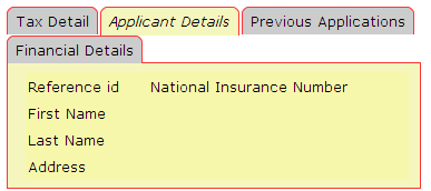
On some occasions, the tab headers can overflow onto second or subsequent lines as shown below.

This occurs when the width specification for the Tab Set Control is not large enough to accommodate its contents. Normally adjusting the width property of the Tab Set Control will resolve the problem.
Control overflows to the right
The Tab Set Control seems to break out of the parent control space. This problem typically occurs when a left margin has been configured for the Tab Set Control. Click here for solutions to this problem.
Tab Set Programming
The On Tab Click event, if specified, is executed when a user clicks on any tab header other than the current selected tab.
The selected tab of a Tab Set Control can be read or changed via its selected property. This property contains the item name of the currently selected tab and can be used to get or set the currently displayed tab e.g.
set TABSET1.selected = 'TAX';
if [TABSET1.selected = 'XYZ']
..
If the selected tab has not been set programmatically, the first tab is displayed.
Input Data Validation
Validation is only ever performed on input fields that are visible to the user; validation is not performed on data behind undisplayed tabs. This includes both system validation (mandatory check, input type check, validators) and customer supplied validation (validation events). In general, placing mandatory fields behind a tab (other than the first displayed tab) should be avoided; if this is required, it is the responsibility of the application to check that all required tabs have been visited by the user – this could be achieved by adding a script to the On tab click event.