List Item Control
See also: Working with Lists, List Control, List Panel Control
Description
A List Item Control represents an HTML list item tag <li> and can be used in conjunction with a List Panel Control (for static content) or a List Control (for dynamic content). A List Item Control is a general purpose container and can contain any other controls.
See Working with Lists for more information.
Properties
See also control common properties and local/inherited control properties.
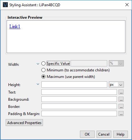
Style Tab - Styling Assistant
|
Property |
Description |
Name1 |
Type1 |
Get1 |
Set1 |
Get/Set Values1 |
|
Width |
Sets the width to one of the following: · A specific value e.g. 300px · The minimum value: this results in the control being just as wide as it needs to be to accommodate its children. · The maximum value: the width is taken from the parent container control. This width will then include the control plus any configured padding, border or margins. Note that this setting will be ignored if the parent container layout specifies a horizontal cell alignment of fill (this applies to Horizontal Box, Vertical Box and Column layouts). This is equivalent to specifying maximum above. Warning: when a specific value is set, any padding, border or margins will be in addition to the specified value and can cause the control to “break out” of its parent space. In particular, try and avoid specifying a width of 100%; use maximum instead. See also: understanding width. |
width |
Character |
Yes |
Yes |
As per CSS width property null: equivalent to maximum Child: equivalent to minimum |
|
Height |
Sets the height. See understanding height. |
height |
Character |
Yes |
Yes |
As per CSS height property |
|
Text |
Sets the text properties for any child controls: font, size, color, bold, italic etc. See text properties. |
|
|
|
|
|
|
Background |
See background properties. |
|
|
|
|
|
|
Border |
Border properties for the control. See border properties. |
|
|
|
|
|
|
Padding & Margin |
Padding is the space inside the border. Margin is the space beyond the border. See padding and margin properties. |
|
|
|
|
|
|
|
|
|
|
|
|
|
|
Style |
CSS class and inline style for the control. |
cssClass style |
Character |
Yes |
Yes |
As per HTML class parameter As per HTML style parameter |
Html Element Properties Tab
This allows you to add element properties to the root element of the Control – see Html Element Properties for more information.
1 See accessing control properties from scripts
Examples of setting properties from scripts:
|
FPL: |
API
Language (Javascript): |
|
set listItem1.width
= '1000px'; set listItem1.textBold
= 'Bold'; set listItem1.backgroundColor
= '#FFFFCC'; set listItem1.style =
'border-radius:10px;-moz-border-radius:10px;'; |
controls.listItem1.width
= "1000px"; controls.listItem1.textBold
= "Bold"; controls.listItem1.backgroundColor
= "FFFFCC"; controls.listItem1.style
= "border-radius:10px;-moz-border-radius:10px;"; |